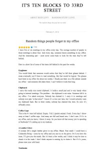
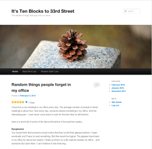
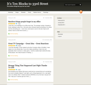
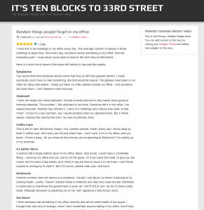
I’ve received a bunch of comments about the design of my blog. Many people feel that it’s too hard to navigate, too sparse, too simple and not nearly attractive enough. I’m not sure I agree. I think it’s very easy. I like the use of white space. And at the end of the day, it’s easy to read. But here’s what you’ve said:
“Does anyone use that ugly teal color anymore?”
“Where’s the navigation? I’m looking for older posts and they’re all the way at the bottom. I hate that!!!!” (I love the four exclamation points.)
“Uggggg – I love the writing, hate the blog.”
“I’m a freelance designer who will happily redesign your blog for you.”
OK – I give – I’ll try some other designs.
You can be my mini focus group. Think of today as a quantitative testing methodology. Your choices will be counted and tabulated. The results will be immediate – as I will keep my blog in its current format – or in the newly redesigned format beginning tomorrow.
Vote. If there’s a format you particularly like and I didn’t include – please let me know. Click on any image to see it larger.
Choice #1:
Choice #2
Choice #3:
Choice #4:
Choice #5:
Choice #6:
That’s it. Seven choices in all. I’ve picked them all for their simplicity. Some have easier navigation. Some have areas for images. Some are just nice and easy.
I can live with all of them. What do you think? Fill out the poll below. Thanks.


This poll seemed to last 6.5 seconds! I’m just reading about it now.
LikeLike
Hmm, I’ve never found a “design by committee” project to turn out well. Good luck.
LikeLike